Wednesday, January 30, 2013
Cover Art
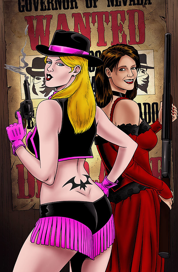
Here is the finished cover for Starring Sonya Devereaux #3 that I completed recently. Created and written by Nick Capetanakis and Todd Livingston, Art by Brendon Fraim and Brian Fraim, color by Rafael Rivera.
STARRING SONYA DEVEREAUX adapts, in comic book form, each film in the career of fictional B-movie actress and scream queen Sonya Devereaux, America's 306th best actress. No budget is too low, no dialog too cheesy and no plotline too thin to keep Sonya from appearing in these straight to DVD flicks. From horror -- to action -- to erotic thriller, each issue is a laugh-filled send up of a different genre and movie -- but they all have one thing in common: Sonya Devereaux and FUN! Okay, that's two things. But just like gravy on mashed potatoes is delicious, Sonya in a crappy movie is hilarious! You can learn more about Sonya on her facebook page
https://www.facebook.com/pages/Starring-Sonya-Devereaux/23574393800?fref=ts#!/pages/Starring-Sonya-Devereaux/23574393800
Thanks for stopping by, Enjoy!!!


Thursday, January 24, 2013
BlueSky Studios Robots
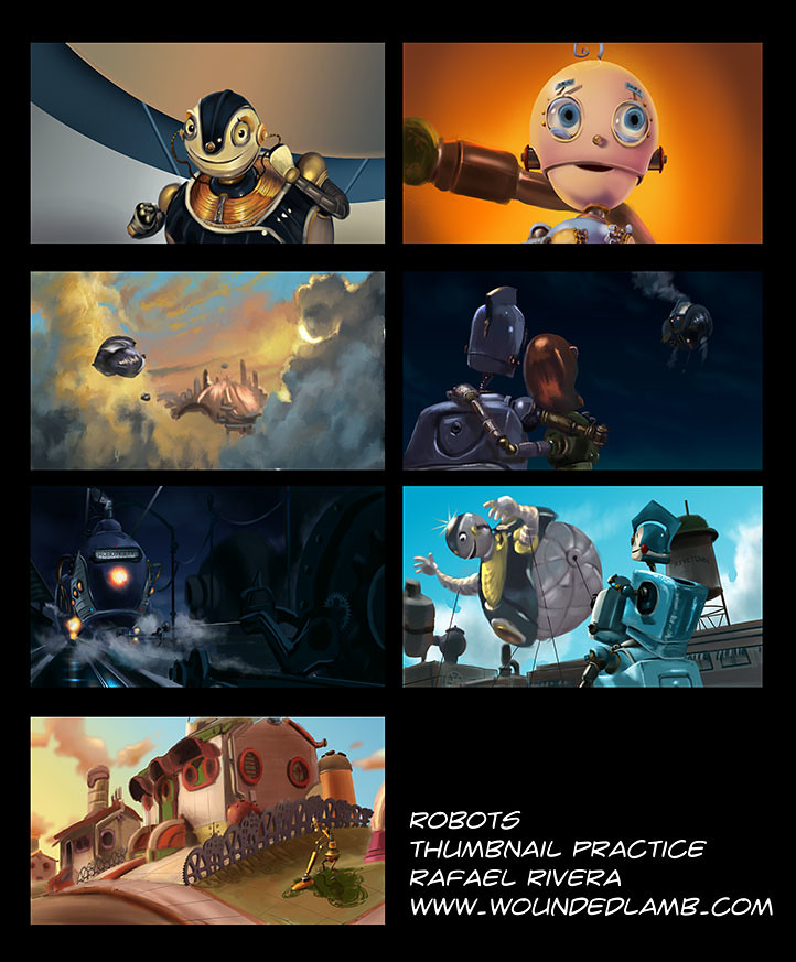
From Wikipedia: Robots is a 2005 American computer animated comic science fiction film produced by Blue Sky Studios for Twentieth Century Fox, and was released theatrically on March 11, 2005. The story was created by Chris Wedge and William Joyce, a children's book author/illustrator. The two were trying to create a film version of Joyce's book Santa Calls but instead they came up with a movie about robots. Joyce served as producer and production designer for the film. It features the voices of Ewan McGregor, Halle Berry, Greg Kinnear, Mel Brooks, Amanda Bynes, Drew Carey and Robin Williams. Here are some thumbnail compositions I did from screen grabs of the film. trying to focus mostly on color, mood and composition with these studies. I just love this movie, it's one of my favorite. The guys at Bluesky studios did an awesome job. I highly recommend the Art Of Robots book as well. Theses thumbnails are done at a smaller scale then what is posted here, but I increased the size so they are easier to view. A bit about my process: To block these in quickly I usually start off with a gradient for the background, then keeping everything on separate layers, I block in the simple forms with either shapes or the lasso and line tools (concentrating on the basic shapes that make up all of the elements in the composition). I then start to render those shapes with the proper lighting according to my reference picture. The come the details. It seems to come together very quickly when I do it this way:) I try to keep each study between 1 to 2 hours. I feel this exercise has helped me get a better handle on composition, color theory and design. If you have as many movies as I do, then you have an endless amount of reference pics, so no excuses, study from the pros, get painting and get better:) Thanks for stopping by, Enjoy!!!

Labels:
3D animation,
art theory,
Art tutorial,
Bluesky Studios,
Chris Wedge,
Color Theory,
composition,
design,
Drew Carey,
Ewan Mcgregor,
Halle Berry,
Mel Brooks,
robots,
The Art Of Robots,
Thumbnails,
William Joyce
Tuesday, January 22, 2013
Giants
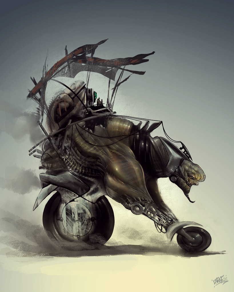
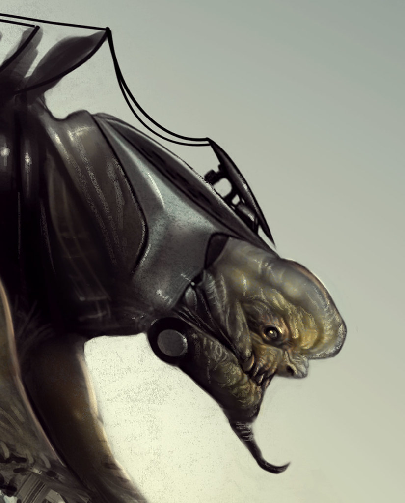
This concept started off as a page of random silhouette thumbnails. The idea here is that this race of people captures giants and turn them into beast of burden that can better serve their needs. These big guys are not much of a threat without their limbs and maybe some device that inhibits the thoughts. I intend to explore this further and perhaps refine the idea better. The persective and anatomy is not perfect, but it works as an initial idea. Thanks for stopping by, Enjoy!!!


Labels:
beast of burden,
concept design,
Creature Design,
Giants,
Thumbnails
Saturday, January 19, 2013
How To Train Your Dragon
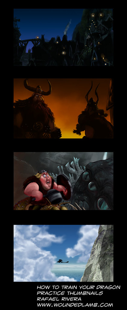
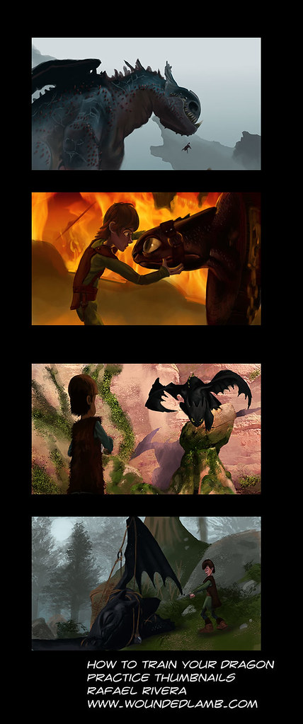
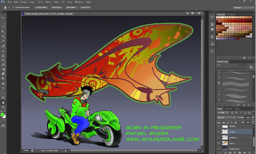
The title should really be "How to train your artist" One way I like to train is by going through some of my movies and taking screen grabs from the film that I find have interesting compositions or color that I can benefit from. In this case Dreamworks, How to Train Your Dragon. I try to keep these studies at about an hour or so each. Theses eight thumbnails are done small but at a widescreen aspect ratio. I blew them up a bit here so they are easier to view. Below them is a graffiti piece, work in progress that I will be finishing up soon as well. Thanks for stopping by, Enjoy!!!


Thursday, January 17, 2013
Beam Me Up
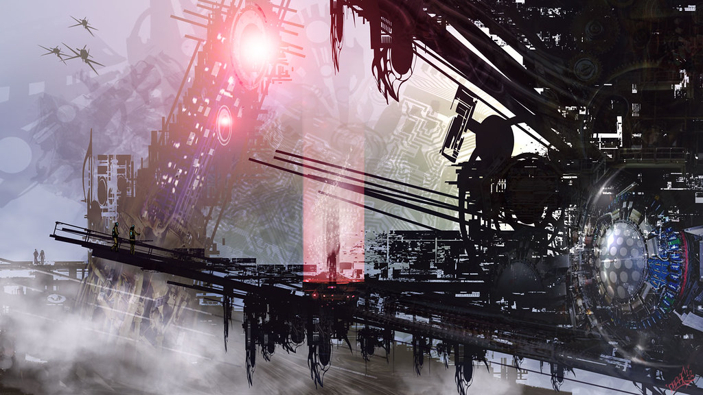
This was an experiment using mostly the shapes tool and custom brushes in Photoshop cs6. I believe I was watching John Carpenter's They Live at the time, and I liked the idea of the teleportation device shown towards the end of the film. Making something out of the abstract is one of my favorite ways to work, especially with sci-fi environment stuff.
Thanks for stopping by. enjoy!!!

Wednesday, January 16, 2013
Latin Singer Marc Anthony
From Wikipedia: Marco Antonio Muñiz (born September 16, 1968), known professionally as Marc Anthony, is a Puerto Rican/American actor, record producer and singer-songwriter. Anthony is the top selling tropical salsa artist of all time. The two-time Grammy and three-time Latin Grammy–winner has sold more than 12 million albums worldwide. He is best known for his Latin salsa numbers and ballads. Anthony has won numerous awards and his achievements have been honored through various recognitions. He was the recipient of the 2009 Congressional Hispanic Caucus Institute (CHCI) Chair's Award. He also received the "2009 CHCI Chair's Lifetime Achievement Award" on September 16, 2009. He has also starred in film's including The lead role in El Cantante where he played the lead role about the life of salsa music legend Héctor Lavoe, along side his wife (at the time) Jennifer Lopez.
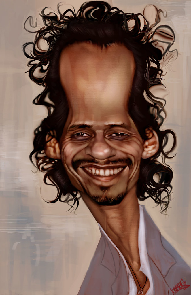
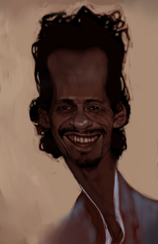
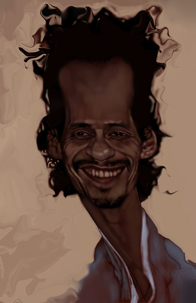
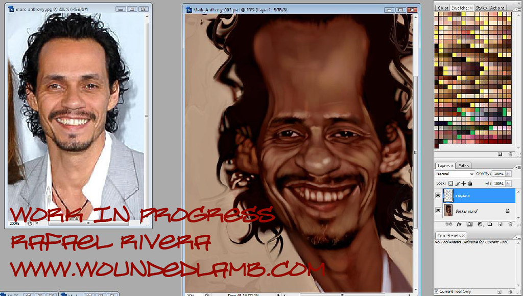
Below is my caricature of Marc Anthony with a few process shots and a screen grab showing the original reference picture. Thanks for stopping by, Enjoy!!!


Labels:
caricature,
El Cantante,
Hector Lavoe,
J Lo,
Jennifer lopez,
Marc Anthony
Monday, January 14, 2013
Reservoir Dogs
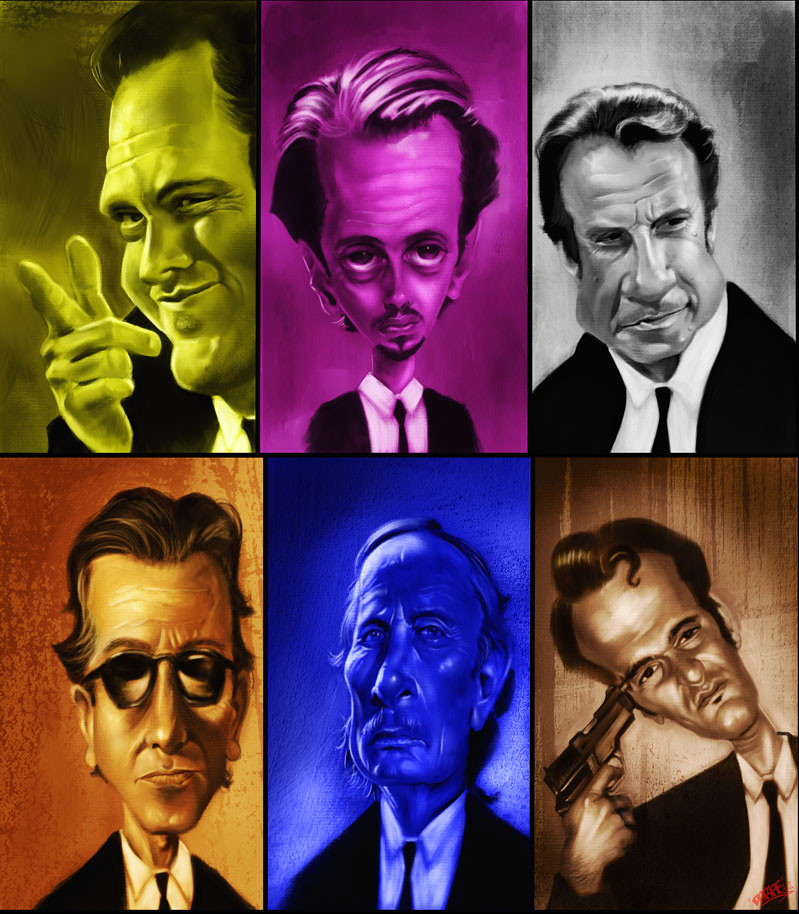
From Wikipedia: Reservoir Dogs is a 1992 American crime film marking the debut of director and writer Quentin Tarantino. It depicts the events before and after a botched diamond heist, but not the heist itself. Reservoir Dogs stars an ensemble cast: Harvey Keitel, Steve Buscemi, Tim Roth, Michael Madsen, Chris Penn, and Lawrence Tierney. Tarantino has a minor role, as does criminal-turned-author Eddie Bunker. The film has become a classic of independent film and a cult hit. It was named "Greatest Independent Film of all Time" by Empire magazine. Reservoir Dogs was generally well received, and the cast was praised by many critics. Here is my caricature study of the cast done in monochrome with the actors given the color that matches their names in the movie, Mr. Blonde, Mr. Pink, Mr. White, Mr. Orange, Mr. Blue,and Mr. Brown. Caution Spoiler Alert for anyone who has never seen the film. lol: Mr. Orange is the only one with shades on for a reason;) " Clowns to the left of me, jokers on the right, here I am stuck in the middle with you". Thanks for stopping by, Enjoy!!!

Saturday, January 12, 2013
Indiana Jones Caricature Tutorial
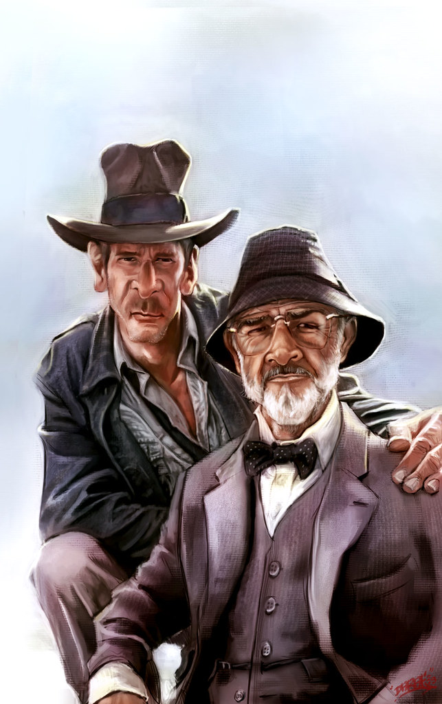
I have been asked by several people about my process on how I do a caricature, so I have decided to save some process shots of my caricature of Indiana Jones (Harrison Ford) and his Dad (Sean Connery) from the movie Indiana Jones and The Last Crusade to help me explain how I approach a piece like this. This was done in Photoshop cs6 and Corel Painter 12. Now I still consider myself to be a student of art myself and am always looking to experiment and learn, but I will try my best to articulate how I do what I do, and I hope it is a help to someone out there.
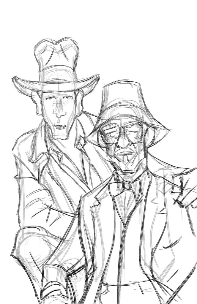
 1) Make Your Mark: The clear white page can be intimidating, but you need to strike all negativity from your mind at this point and start to make marks in a confident fashion. I start to draw my subjects and since this is a caricature I focus mainly on the shapes of heads and bodies of the reference pics and source material and keeping in mind how those shapes can help to exaggerate the subjects yet still convey clearly who and what they are.
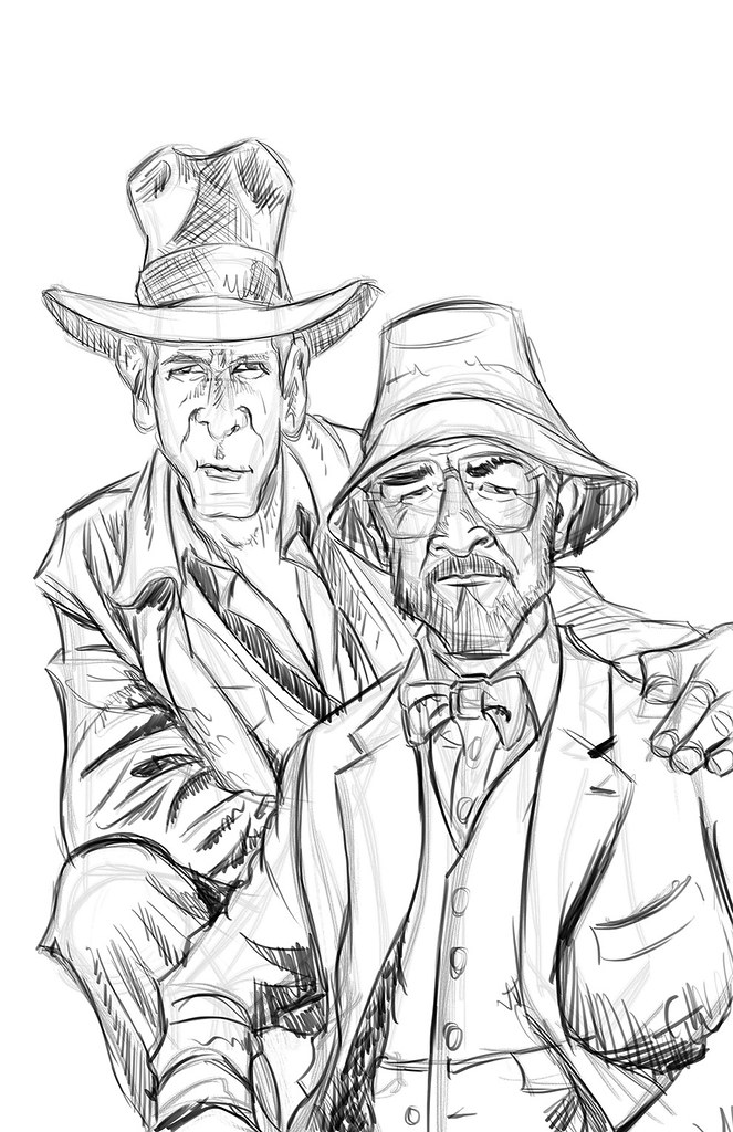
 2) Refining The Sketch: The initial sketch is done on auto pilot, meaning very loosely. As soon as I feel I start to get a likeness I lower the opacity of the initial sketch, make a layer above the sketch layer and start to refine the sketch and add details to the drawing.
 3)Basic Shading: Once I feel comfortable with the sketch I decide to tone the canvas and start in on the shading. I do this by setting the sketch layer to multiply and creating a new layer underneath the sketch layer that I fill with a medium grey tone. i then use a soft airbrush to start shading the piece according to the reference material, adding darks and lights as I see fit. I work with a big brush and stay zoomed out concentrating on the big overall shapes and not the finer details at this point. It helps to squint the eyes at your source material to see where the shadow shapes and the light shapes belong.
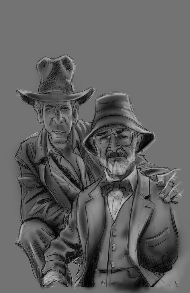 4)light Pass: After the basic shading I decide to do a quick light pass in a similar fashion. Still zoomed out, still squinting the eyes, and still very loose. I also start to slowly pop the main subjects out from the background with lighter tones.
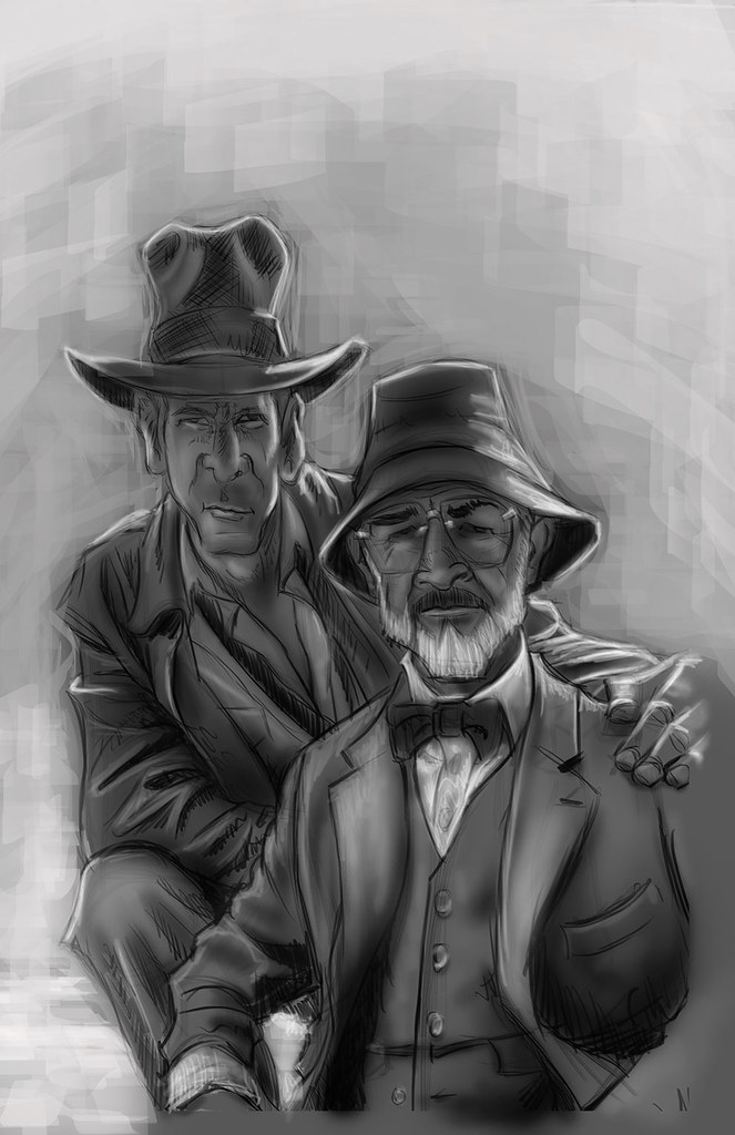 5)Tighten up the tonal values: Now I start to zoom in and pay more attention to details, still working in greyscale. up until now I worked pretty quickly, but now I start to slow down a bit and clean things up quite a bit. I also switch over from photoshop to painter to experiment with paper textures and different brushes.
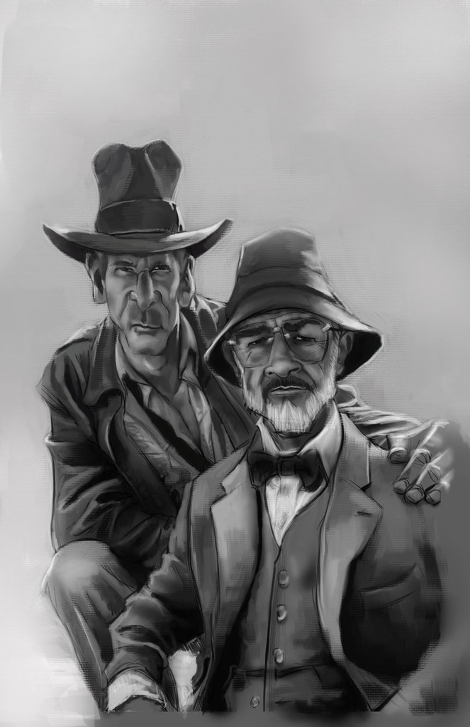 6)Starting to lay down the color: I now go back to photoshop and create new layers set to overlay and color, to start blocking in the initial color adding more details as I see fit.
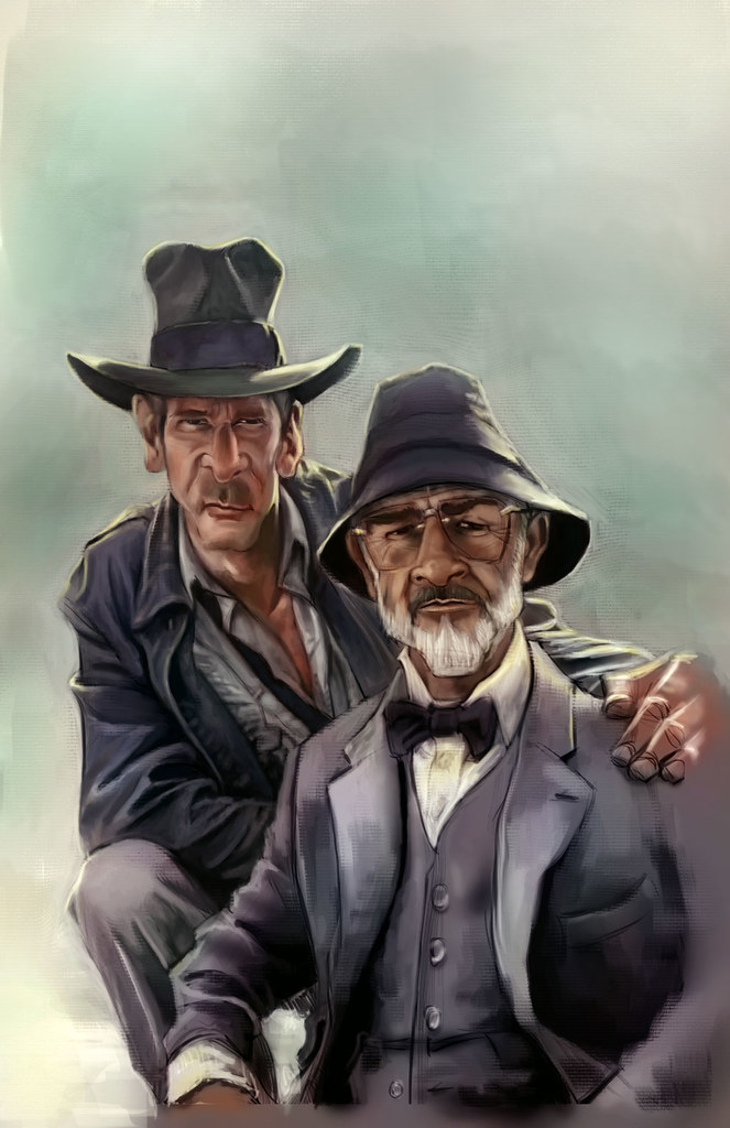 7)At this point I decide to add some subtle photo textures to enhance the piece. I also adjust the colors and the contrast to my liking. I have to take a great deal of artistic license at this point because my reference pic is not of very good quality.
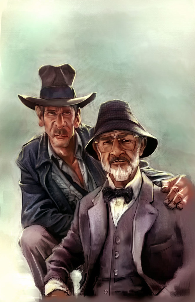 8)The Devil is in the details: Now I take as long as I need moving things around, altering the colors and zooming in to detail the piece. This is the most tedious and long step of them all, refining and polishing till it is done. It can also be the most fun. I keep most of the detail on the faces and parts of the clothing, but the rest is left very sketch, because I want the eyes of the viewer to be drawn to the characters faces.
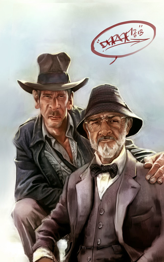 9) Done: For now i call it a wrap. I do some last minute details and give it the ole' John Hancock. Thanks for stopping by, I hope you have enjoyed this mini tutorial and much as i have have enjoyed working on it. If you have any questions feel free to ask me and I will do my best to answer them.

 1) Make Your Mark: The clear white page can be intimidating, but you need to strike all negativity from your mind at this point and start to make marks in a confident fashion. I start to draw my subjects and since this is a caricature I focus mainly on the shapes of heads and bodies of the reference pics and source material and keeping in mind how those shapes can help to exaggerate the subjects yet still convey clearly who and what they are.
 2) Refining The Sketch: The initial sketch is done on auto pilot, meaning very loosely. As soon as I feel I start to get a likeness I lower the opacity of the initial sketch, make a layer above the sketch layer and start to refine the sketch and add details to the drawing.
 3)Basic Shading: Once I feel comfortable with the sketch I decide to tone the canvas and start in on the shading. I do this by setting the sketch layer to multiply and creating a new layer underneath the sketch layer that I fill with a medium grey tone. i then use a soft airbrush to start shading the piece according to the reference material, adding darks and lights as I see fit. I work with a big brush and stay zoomed out concentrating on the big overall shapes and not the finer details at this point. It helps to squint the eyes at your source material to see where the shadow shapes and the light shapes belong.
 4)light Pass: After the basic shading I decide to do a quick light pass in a similar fashion. Still zoomed out, still squinting the eyes, and still very loose. I also start to slowly pop the main subjects out from the background with lighter tones.
 5)Tighten up the tonal values: Now I start to zoom in and pay more attention to details, still working in greyscale. up until now I worked pretty quickly, but now I start to slow down a bit and clean things up quite a bit. I also switch over from photoshop to painter to experiment with paper textures and different brushes.
 6)Starting to lay down the color: I now go back to photoshop and create new layers set to overlay and color, to start blocking in the initial color adding more details as I see fit.
 7)At this point I decide to add some subtle photo textures to enhance the piece. I also adjust the colors and the contrast to my liking. I have to take a great deal of artistic license at this point because my reference pic is not of very good quality.
 8)The Devil is in the details: Now I take as long as I need moving things around, altering the colors and zooming in to detail the piece. This is the most tedious and long step of them all, refining and polishing till it is done. It can also be the most fun. I keep most of the detail on the faces and parts of the clothing, but the rest is left very sketch, because I want the eyes of the viewer to be drawn to the characters faces.
 9) Done: For now i call it a wrap. I do some last minute details and give it the ole' John Hancock. Thanks for stopping by, I hope you have enjoyed this mini tutorial and much as i have have enjoyed working on it. If you have any questions feel free to ask me and I will do my best to answer them.

My book is now in the Apple I-bookstore
Friday, January 11, 2013
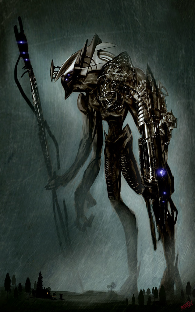
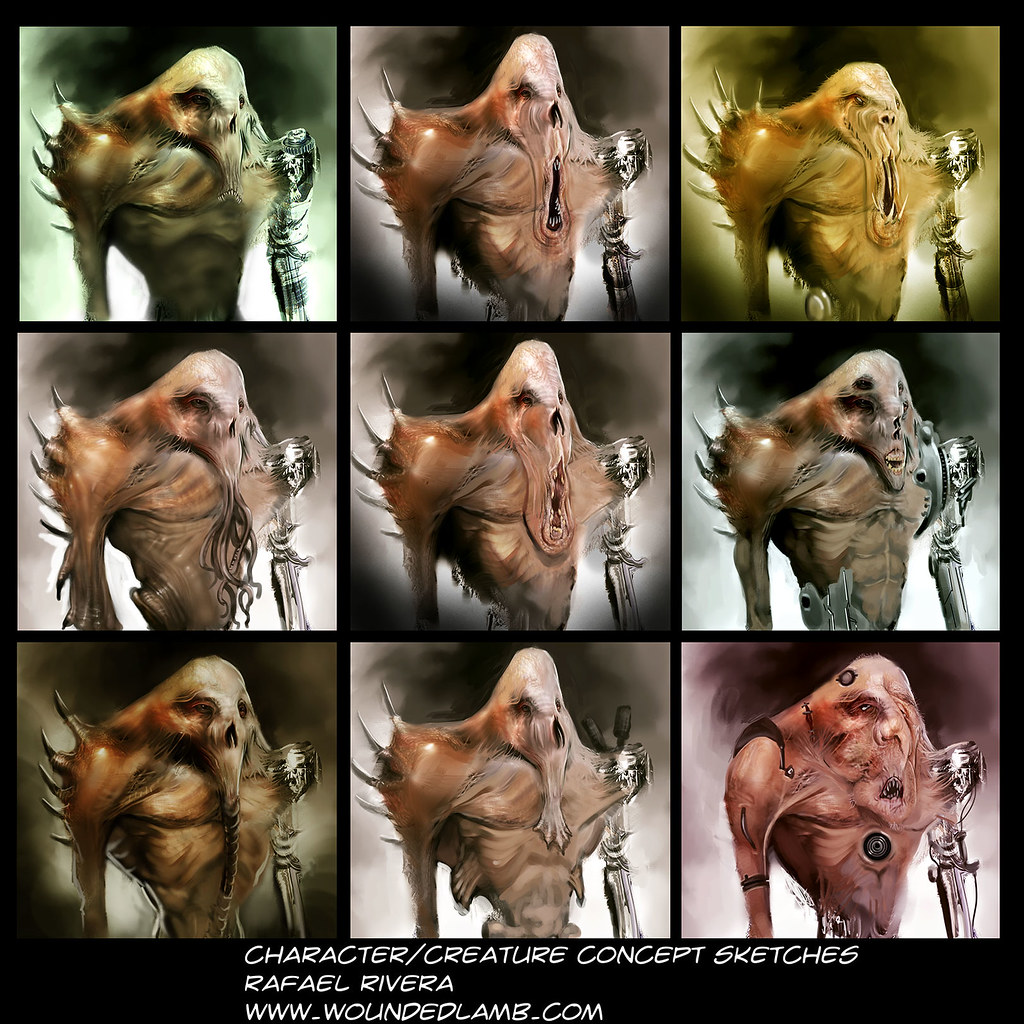
Bio Mechanical Mutants
Tuesday, January 8, 2013
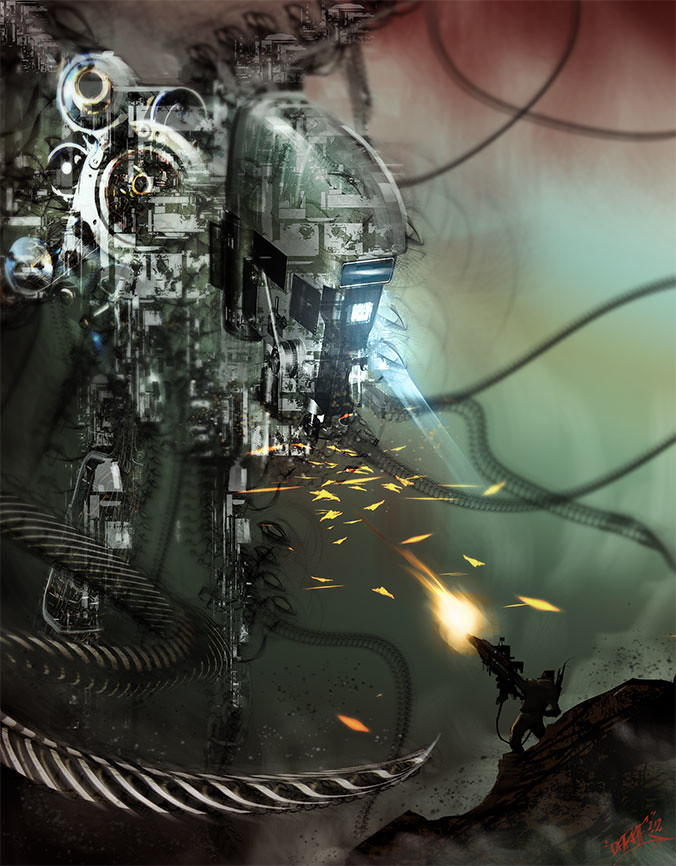
Man Versus Machine
Friday, January 4, 2013
Creatures, Mechs and Vehicles
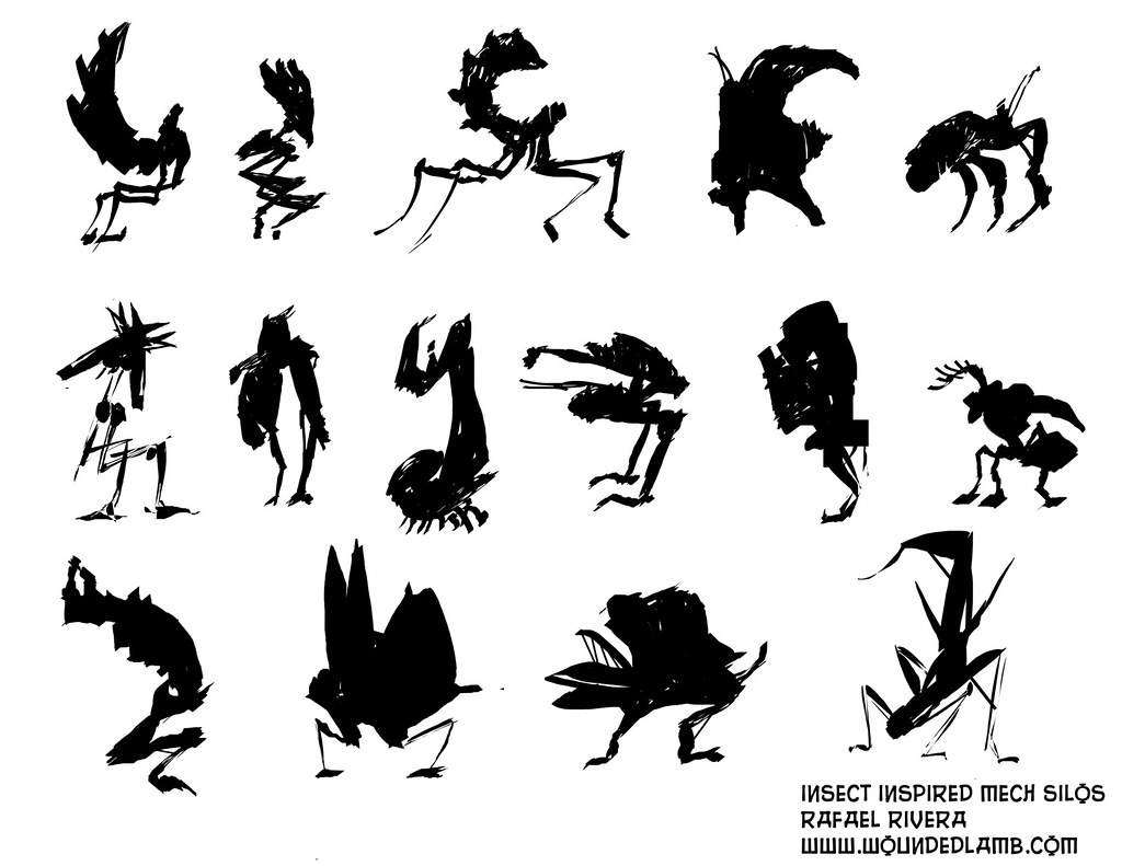
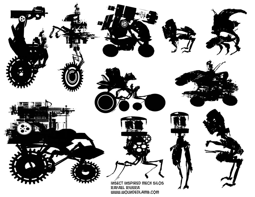
Here are a couple thumbnails pages for some possible Creature and mech designs. I filled up tons of pages of these, so I expect to start fleshing them out real soon. Thanks for stopping by. Enjoy!!!!



Labels:
Concept art,
Creature Design,
Insects,
Mech design,
robots,
vehicle concept design
Subscribe to:
Posts (Atom)
Blog Archive
About Me
- DARAF
- I am an Art Director/ freelance illustrator working in the Movie, Comics and Gameing industries. I have also provided graphics for advertisement companies and clothing companies. I am Currently working as Lead Artist for Soul Interface Studios (SIS) and always willing to discuss exciting new opportunities.
